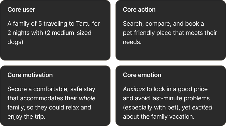
Project background
01
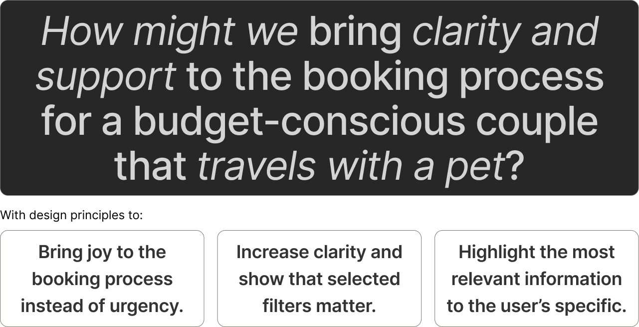
Booking.com treats pets as an afterthought
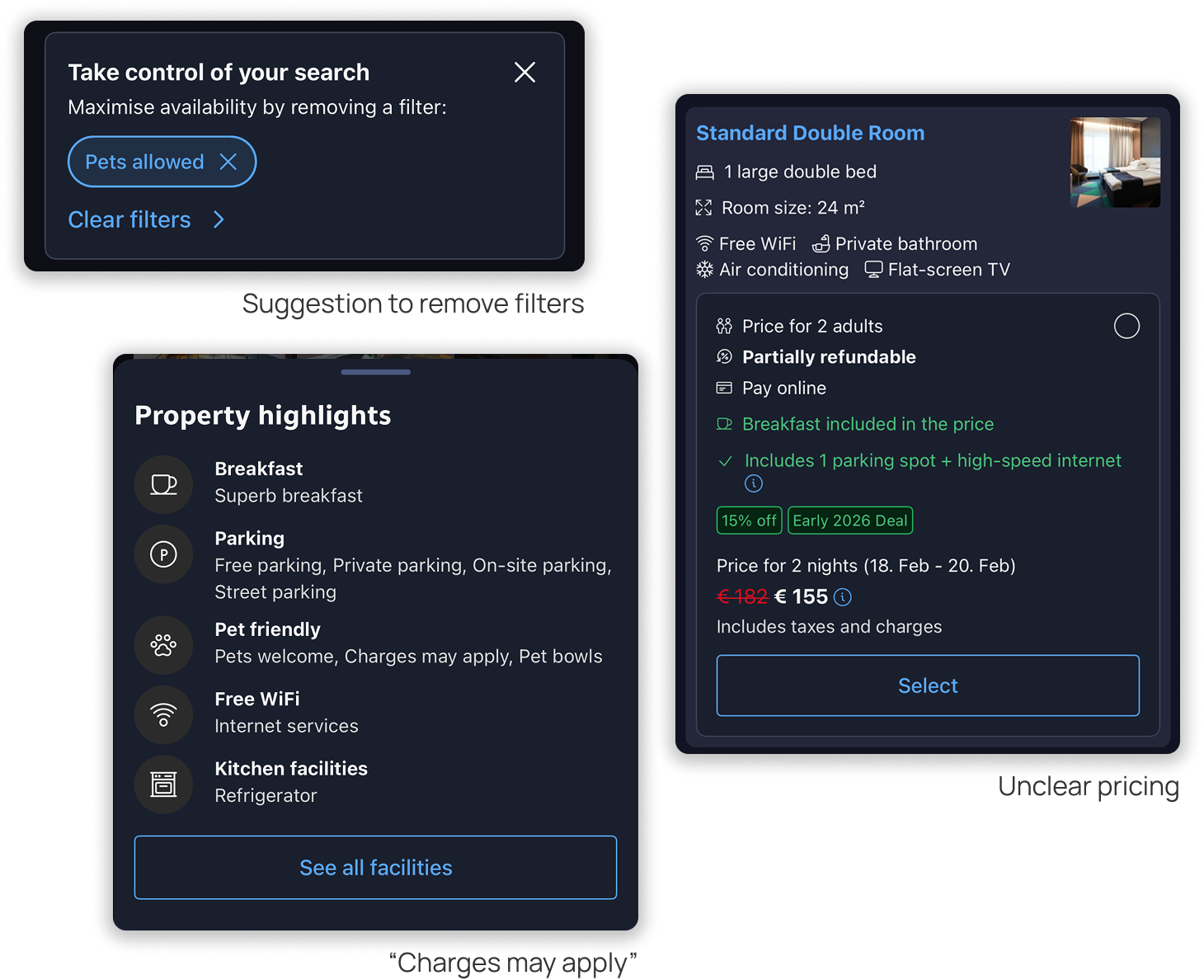
Booking recommends that users change or remove filters, to see more results on their search.
Reality is that user cannot pay for their pet via booking platform but needs to sort it with host directly.
Users feel pressured to book quickly by "good price" banners.
Reality is that user cannot pay for their pet via booking platform but needs to sort it with host directly.
Users feel pressured to book quickly by "good price" banners.
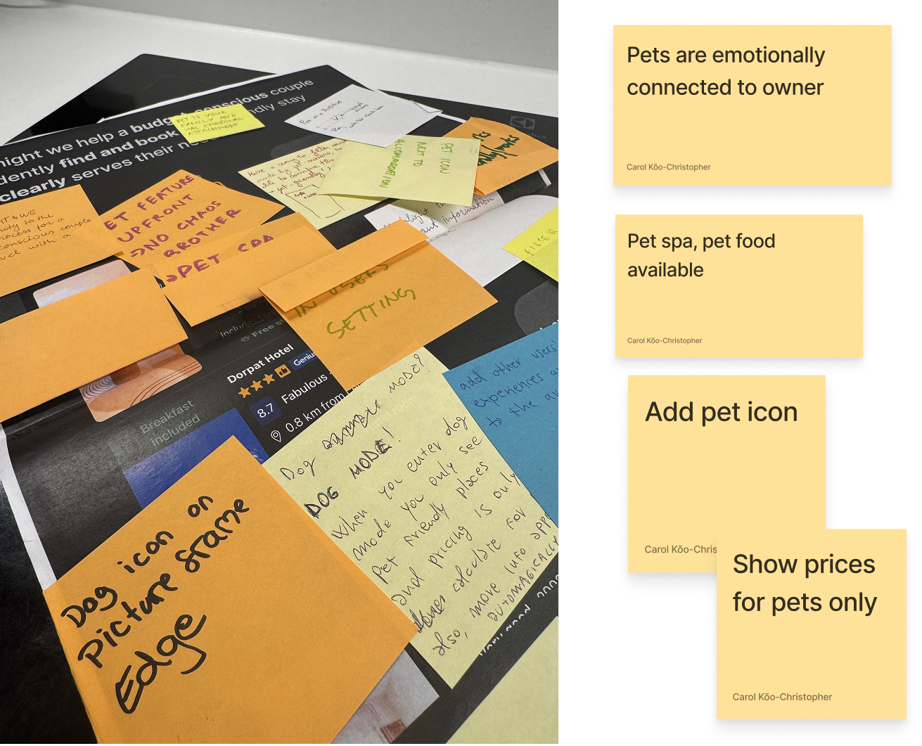
Key adjustments
02
tweaks I made to include pets in the booking flow
Keep the booking.com brand but make it pet friendly
I preserved the app’s authentic branding and made changes fit into the existing flow, flipping the approach from treating pets as a simple filter to recognizing them as guests in the interface.
With this pet needs, counts, and fees became visible without disrupting the familiar booking experience.
With this pet needs, counts, and fees became visible without disrupting the familiar booking experience.


Let users shape their experience
Before showing listings, users enter a "pet mode" tailored for travelers with furry companions. They choose a Booking Buddy—Dog, Cat, or Other—which personalizes the interface and makes the experience feel more relevant and welcoming.
Milo — a friendly guide, not a workaround for missing listings
Instead of pushing users to change or remove pet filters, a friendly guide now advises users through the flow. Milo (or other pet) brings behavioral delight and helps users pick the best pet‑friendly spot without forcing compromises.


Mosaic vs. Single Hero image
A large hero image lets users inspect space and details at a glance and creates a stronger emotional impact, especially on mobile, where booking often happens on the go and promotions/discounts need to convert quickly.
The research showed that users find reviews from other guests honest and helpful. Oftentimes there is information that otherwise would go unnoticed. So here- Milo is guiding straight to the review section saving user the scroll.
The research showed that users find reviews from other guests honest and helpful. Oftentimes there is information that otherwise would go unnoticed. So here- Milo is guiding straight to the review section saving user the scroll.
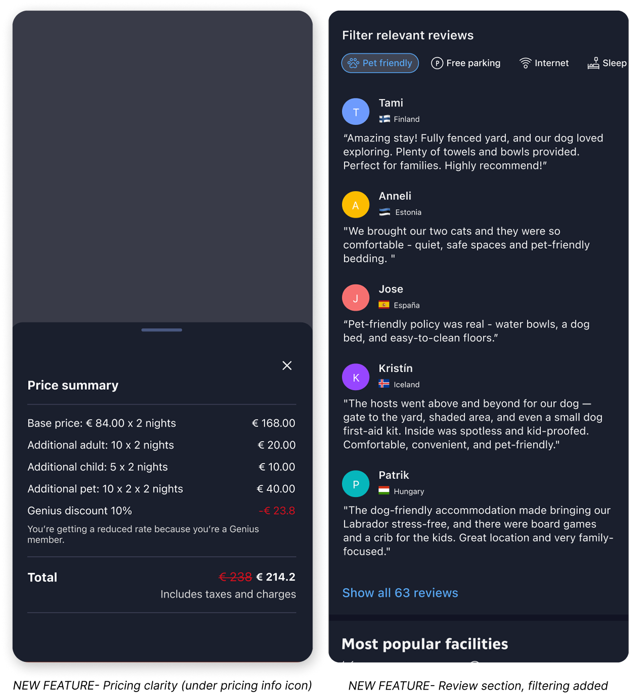
Addition: Pricing Clarity & Focused Reviews
I added a clear pricing breakdown that lists all extra costs and shows per‑night charges by guest type (adults, kids, pets, etc.), so users see the true total before confirming.
I also added review filters- pet experiences, sleeping arrangements, Wi‑Fi, parking etc. That way users can quickly find the insights that matter to them most.
I also added review filters- pet experiences, sleeping arrangements, Wi‑Fi, parking etc. That way users can quickly find the insights that matter to them most.

Calm confirmations that reduce cognitive load
To make pricing and offers clearer I regrouped Booking’s many offers (they have a lot!) while keeping the original card placement and content. Minor tweaks to spacing and visual hierarchy can go a long way.
For the outro and booking confirmation Milo is there to add positive energy and excitement. Because traveling with pets or kids can be overwhelming, I included short tips and reminders to reduce cognitive load (e.g., “check required documentation,” “choose direct routes”) plus quick actions to contact the host or return to the homepage.
For the outro and booking confirmation Milo is there to add positive energy and excitement. Because traveling with pets or kids can be overwhelming, I included short tips and reminders to reduce cognitive load (e.g., “check required documentation,” “choose direct routes”) plus quick actions to contact the host or return to the homepage.