Project background
01
How could in-app recommendations feel more relevant to everyday life?
Bolt Food is a habit-driven app: people use it to order lunch, re-order favorites, restock groceries, or get dinner after work. These actions begin from internal triggers (hunger) or external triggers (notifications, links, app icon, social posts). Bolt's business goals are repeat usage and improved experience. But how to get users back in the app, if ordering food is a convenient luxury, not a necessity. That is why the app must become more relevant, trusted, and emotionally engaging over time. We aim to build a relationship, not just serve one need. Our brief was to shift Bolt Food from a passive list of options into a context-aware companion that adapts to user and knows when to simplify or when to suggest something new.
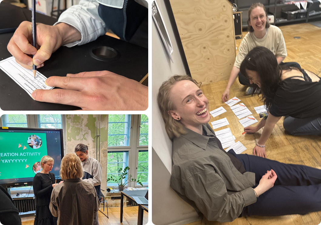
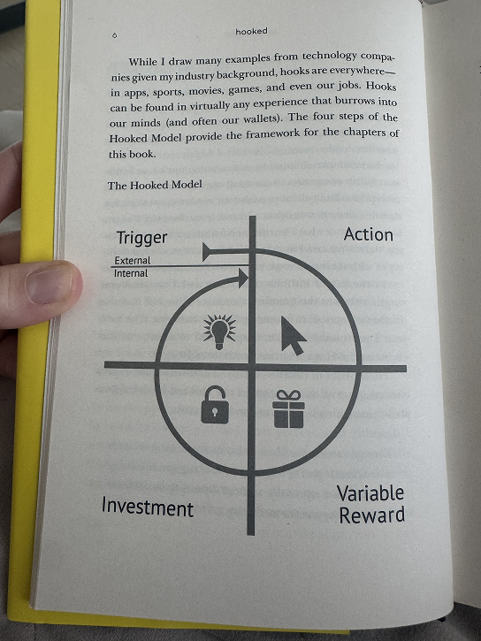
To understand how habits form, I audited the app using Nir Eyal’s Hooked Model (trigger → action → variable reward → investment) and mapped the experience across awareness, choosing, waiting, and receiving. Research methods included a service safari, interviews, journey mapping, prototype testing, and a co-creation workshop with 10 participants (3 groups). The goal was to see how people pick food, compare choices, respond to context, and how Bolt can learn from repeated use without forcing lengthy onboarding.
To understand how habits form, I audited the app using Nir Eyal’s Hooked Model (trigger → action → variable reward → investment) and mapped the experience across awareness, choosing, waiting, and receiving. Research methods included a service safari, interviews, journey mapping, prototype testing, and a co-creation workshop with 10 participants (3 groups). The goal was to see how people pick food, compare choices, respond to context, and how Bolt can learn from repeated use without forcing lengthy onboarding.
personas
02
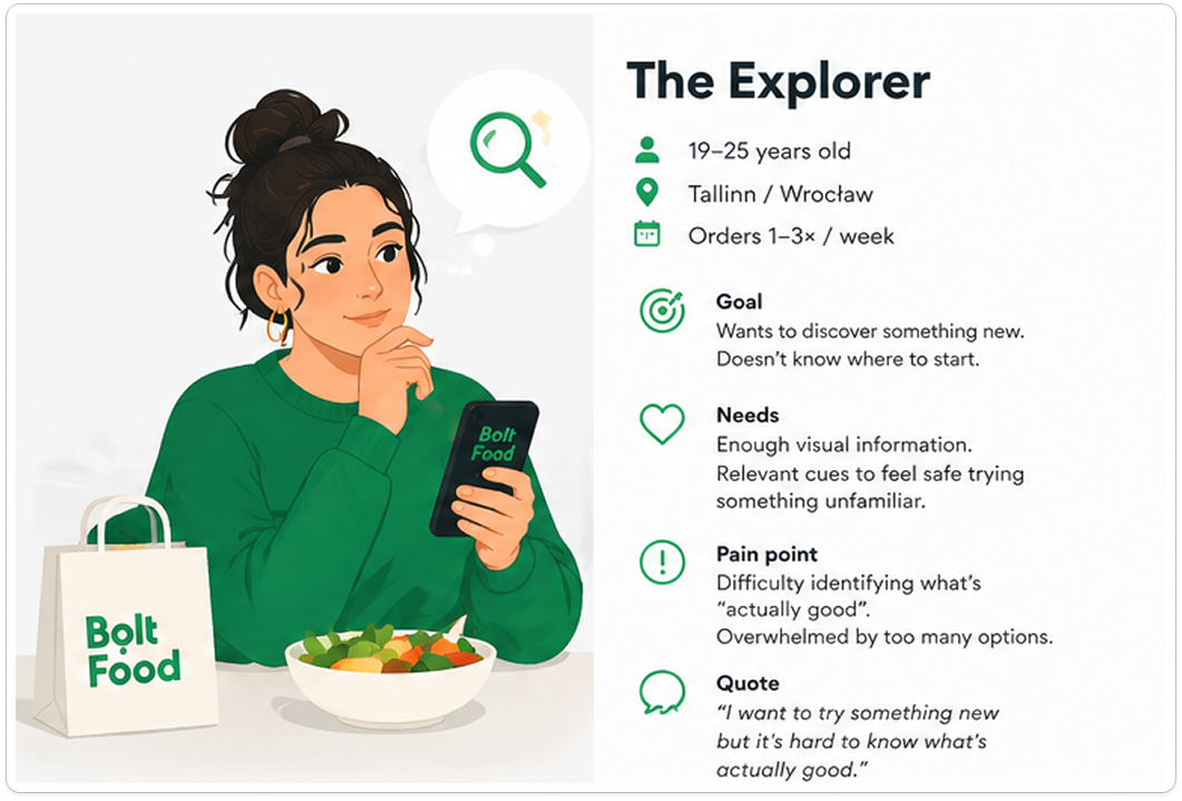
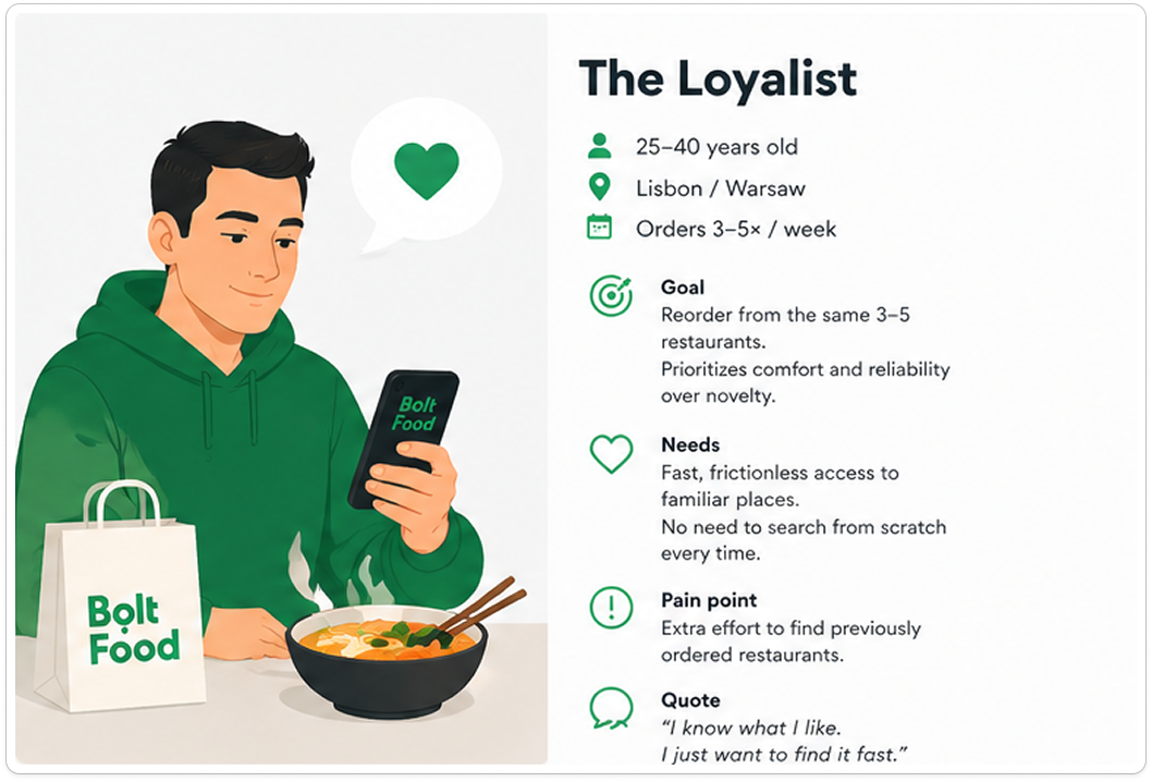
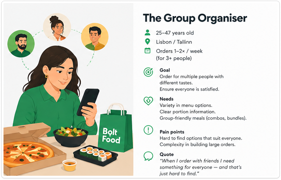
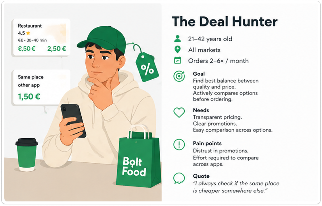
Personas given by the client

research background
03
Background to user clustering concept
Hooked Model Analysis
We audited Bolt Food through Nir Eyal’s Hook Model (Trigger → Action → Variable Reward → Investment) to map awareness → choosing → waiting → receiving and to compare current behavior with the proposed concept.
Triggers exist but often miss the right moment (e.g., untimely travel notifications). Real triggers are both internal (hunger) and situational: time pressure, social plans, weather, location, salary cycles, and external reminders (notifications, discounts).
Actions are clear: open app, browse restaurants, search cuisine, add to cart, place order, track driver, reorder, and rate. Food ordering, however, contains more friction than ride hailing — mood, time, price, dietary rules, trust and social factors complicate decisions.
Variable rewards today are useful but predictable (discounts, subscriptions, cashback). They reduce pain but don’t create surprise or emotional pull. There’s an opportunity for personalized, contextual rewards that feel like discovery or winning.
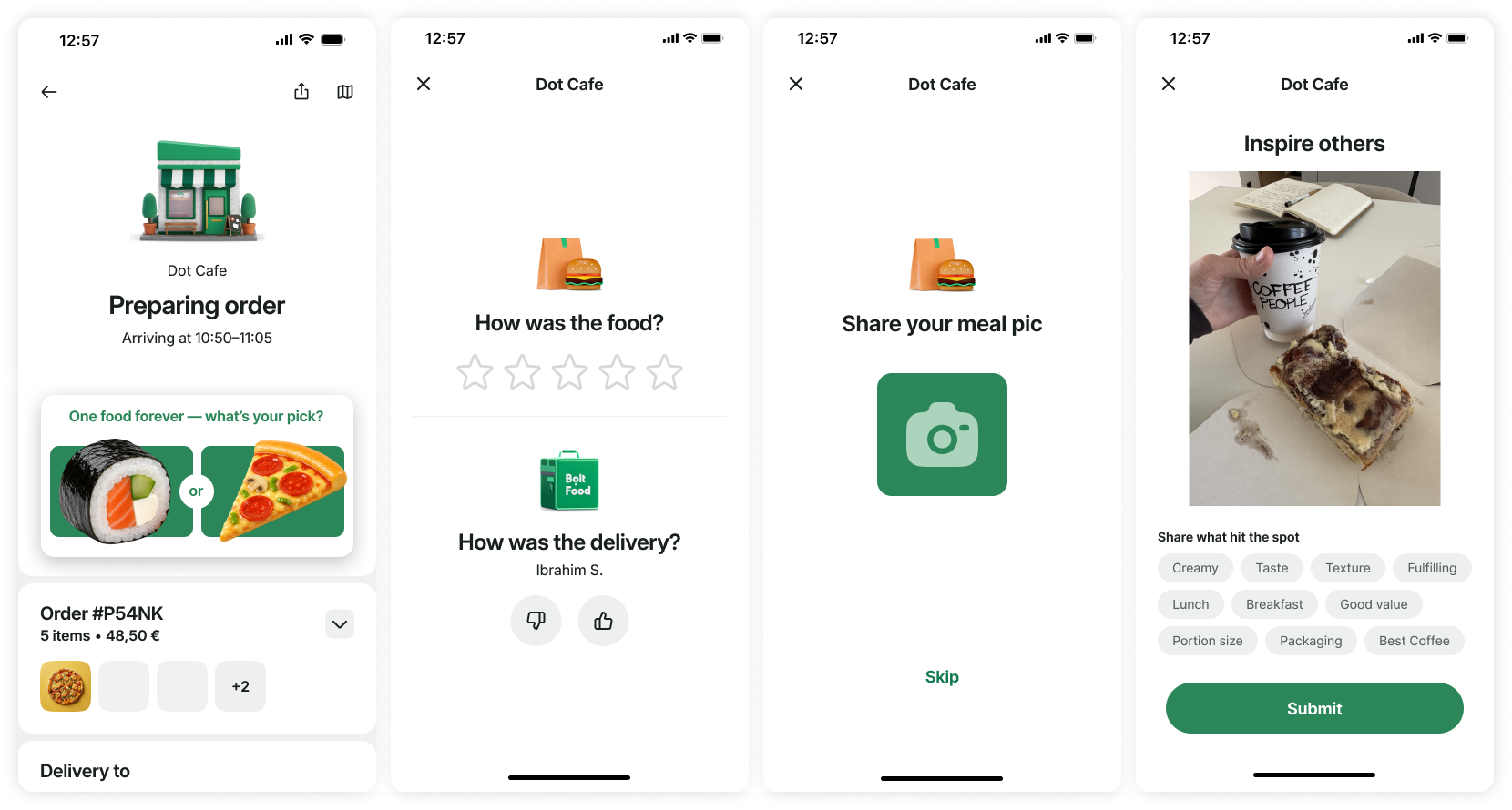
Investment exists via order history, ratings, feedback and shared photos, but users don’t always see their investment improving future experiences. Making that learning visible and rewarding is essential.
Given Bolt’s suite of mobility services: food, groceries, rides, scooters. There’s a clear opportunity to connect these behaviours into a single cross‑service ecosystem. This could enable richer, context-aware experiences (for example, syncing grocery habits with food recommendations), but it falls outside the current brief and should be scoped as a future initiative.
Triggers exist but often miss the right moment (e.g., untimely travel notifications). Real triggers are both internal (hunger) and situational: time pressure, social plans, weather, location, salary cycles, and external reminders (notifications, discounts).
Actions are clear: open app, browse restaurants, search cuisine, add to cart, place order, track driver, reorder, and rate. Food ordering, however, contains more friction than ride hailing — mood, time, price, dietary rules, trust and social factors complicate decisions.
Variable rewards today are useful but predictable (discounts, subscriptions, cashback). They reduce pain but don’t create surprise or emotional pull. There’s an opportunity for personalized, contextual rewards that feel like discovery or winning.
Investment exists via order history, ratings, feedback and shared photos, but users don’t always see their investment improving future experiences. Making that learning visible and rewarding is essential.
Given Bolt’s suite of mobility services: food, groceries, rides, scooters. There’s a clear opportunity to connect these behaviours into a single cross‑service ecosystem. This could enable richer, context-aware experiences (for example, syncing grocery habits with food recommendations), but it falls outside the current brief and should be scoped as a future initiative.
What We Learned About Data
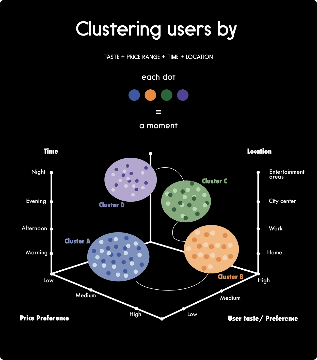
We grouped users through four main parameters: location, time, taste profile, and price.
Time and location change often. People behave differently at home, at work, while travelling, at lunch, late at night, on a Friday, or on a Sunday morning. This all affects what they want, how much time they have, and how open they are to exploration.
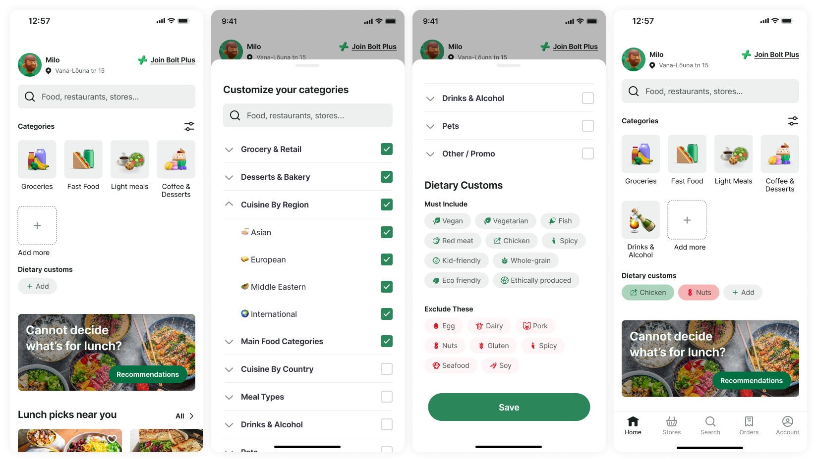
Taste profile behaves differently. Allergens, dietary restrictions, and religious limitations are not playful variables. If someone is vegan, lactose intolerant, gluten-free, or eats halal, that does not change because it is Friday or because they are at work. Taste is not always a compass for exploration. Often, it is a hard filter.
Price also shapes behavior. We can estimate price tolerance from grocery orders, average meal prices, order size, and whether someone usually orders solo, for family, or for a group.
Groceries became especially interesting because they provide ingredient-level habitual data. For example, lactose-free milk in a Sunday grocery order may later help Bolt understand that lactose warnings matter in food ordering too.
Time and location change often. People behave differently at home, at work, while travelling, at lunch, late at night, on a Friday, or on a Sunday morning. This all affects what they want, how much time they have, and how open they are to exploration.
Taste profile behaves differently. Allergens, dietary restrictions, and religious limitations are not playful variables. If someone is vegan, lactose intolerant, gluten-free, or eats halal, that does not change because it is Friday or because they are at work. Taste is not always a compass for exploration. Often, it is a hard filter.
Price also shapes behavior. We can estimate price tolerance from grocery orders, average meal prices, order size, and whether someone usually orders solo, for family, or for a group.
Groceries became especially interesting because they provide ingredient-level habitual data. For example, lactose-free milk in a Sunday grocery order may later help Bolt understand that lactose warnings matter in food ordering too.
Daily behavior changes between breakfast, lunch, dinner, and midnight snacks. Weather can also shift decisions: rain may increase delivery, while sun may make pickup or scooter use more attractive.
Weekly patterns can form around weekdays, like Taco Tuesday, sushi nights, Friday treats, or Sunday fridge restocking.
Monthly patterns include salary days, celebrations, and tighter budget periods. Yearly patterns include holidays, seasons, and returning from a trip to an empty fridge.
User relationship maturity
I view the relationship between a user and a product like a human-to-human relationship. At first meeting it’s exciting and new, people are more open to trying new things and putting their best foot forward. The same is true in the app: new users are likelier to explore, try games, and test out unfamiliar places. Early goals should be to reduce friction, demonstrate value quickly, and prompt a second order. Occasional users need light encouragement to repeat and experiment.
As the relationship matures, it should become more efficient and personal. Our research shows mature users prioritize convenience and expect the app to support their day-to-day needs. They often skip games or irrelevant features. They do still explore, but usually in specific contexts- when routines change, such as date nights, travel, or in group setting. For mature users we must deliver reliability, strong personalization, and targeted discovery. Because they’re often in routines, retention strategies should focus on occasional, well‑timed, high‑value offers.
I view the relationship between a user and a product like a human-to-human relationship. At first meeting it’s exciting and new, people are more open to trying new things and putting their best foot forward. The same is true in the app: new users are likelier to explore, try games, and test out unfamiliar places. Early goals should be to reduce friction, demonstrate value quickly, and prompt a second order. Occasional users need light encouragement to repeat and experiment.
As the relationship matures, it should become more efficient and personal. Our research shows mature users prioritize convenience and expect the app to support their day-to-day needs. They often skip games or irrelevant features. They do still explore, but usually in specific contexts- when routines change, such as date nights, travel, or in group setting. For mature users we must deliver reliability, strong personalization, and targeted discovery. Because they’re often in routines, retention strategies should focus on occasional, well‑timed, high‑value offers.